Is change always good? Last week, the Gap logo got a 20-year facelift, and people were not happy about it.
Gap has been looking to change things up a bit over the course of the last few months, and so far they have done a pretty great job. An innovative Foursquare promotion and arguably the most successful Groupon campaign to date, seem to be leading the company in just the direction they were hoping. Until last week.
 Crisis communication in social media is key. Here’s a look at the good and bad so far in the Gap logo disaster:
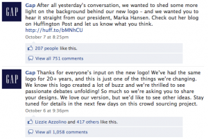
The Gap Facebook page exploded with angry comments over the change, and it seemed rather quickly that Gap was here to help:
In the meantime however, the pranksters have hit the web.

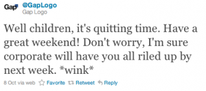
The Bad – @GapLogo – This twitter stream is a bit reminiscent of @BPGobalPR, the account has already amounted nearly 5,000 followers with its gutsy posts. However, unlike BP, the ball is still in Gap’s court as the offical Twitter page boasts nearly 36,000 followers.
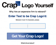
The Ugly – Crap Logo – Design your own branded crap logo with this generator.
The team behind this one also has their own Twitter profile: @craplogo along with 5,ooo Facebook fans. More than 1,400 Twitter users have used the tool so far.
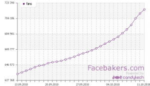
 The Good? – Official Gap Facebook page – Gap is acquiring a ton of new fans with the change. A tool that could be HUGE if they do follow through will a well branded “change our logo” crowd-sourcing project as promised.
What are your thoughts? Has the progress Gap has made thus far been undone? Or are bigger opportunities at large if they can make the situation right?

