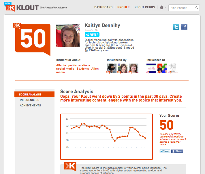
Klout, the popular social influence score platform, has undergone a makeover, offering users a cleaner profile, direct access to Klout Perks and incentives to raise your score.
Take a look at the new homepage below:
In this improved version of the site, users are greeted with their score history highlighting information such as “You’re score dropped 2 points in the past 30 days, create more interesting content, engage with the topics that interest you.”
Quick access to Klout Perks in the top navigation allows users to see any current incentives as well as a glimpse into past promotions. Prior to this design, Klout Perks and their use were difficult to find.
The influencers and achievement tabs on the homepage allow users to easily see an expanded list of those in their network they interact with the most, while achievements show statustics for things like how many ReTweets or Likes a user has generated over time.
While the overall feel of the site is a great improvement, small nuances such as those mentioned above leave users with a distinct call to action on how to actually use and improve their score. Klout can often be mistaken as an arbitrary number and it’s clear they are looking to change that. Great step in the right direction Klout, I know I’ll be checking in more frequently to keep myself engaged.
