Category Archives: Innovation

Foursquare: Earning badges without checking in

18th October 2010

Last month, RunKeeper became the 1st Foursquare partner to allow users to earn badges without checking in. Users can now earn badges by completing tasks rather than heading to a physical location.

I’m a runner myself and although I’m generally a Nike+ user, my sensor recently died and I decided to give RunKeeper a shot. The process could not have been simpler, just connect your Foursquare account within RunKeeper like you would Facebook or Twitter and you’re all set. The app does the rest. For speculators of location based services, this could be a game changer. By earning badges for activities, users are still using the fundamental idea of “exploring” but without the added hassle of remembering to check-in.
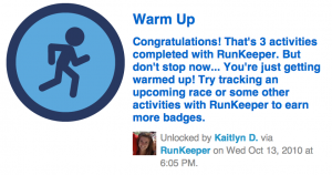
Foursquare has stated it will soon be testing out this feature with other partners, a leap that will allow the service to jump into the action based realm of many other location based applications.

Imagine making a reservation for your favorite restaurant and automatically receiving a  reward? Or scanning a receipt from a boutique and getting a discount? The possibilities and user base are opened much wider with this expansion. What do you think? Will more people be open to using LBS with these integrations?


Gap’s Logo Fiasco & How They are Working to Fix It

11th October 2010

Is change always good? Last week, the Gap logo got a 20-year facelift, and people were not happy about it.

Gap has been looking to change things up a bit over the course of the last few months, and so far they have done a pretty great job.  An innovative Foursquare promotion and arguably the most successful Groupon campaign to date, seem to be leading the company in just the direction they were hoping. Until last week.

Crisis communication in social media is key. Here’s a look at the good and bad so far in the Gap logo disaster:
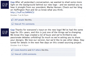
The Gap Facebook page exploded with angry comments over the change, and it seemed rather quickly that Gap was here to help:

In the meantime however, the pranksters have hit the web.

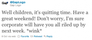
The Bad@GapLogoThis twitter stream is a bit reminiscent of @BPGobalPR, the account has already amounted nearly 5,000 followers with its gutsy posts. However, unlike BP, the ball is still in Gap’s court as the offical Twitter page boasts nearly 36,000 followers.

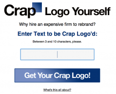
The Ugly – Crap Logo Design your own branded crap logo with this generator.

The team behind this one also has their own Twitter profile: @craplogo along with 5,ooo Facebook fans. More than 1,400 Twitter users have used the tool so far.

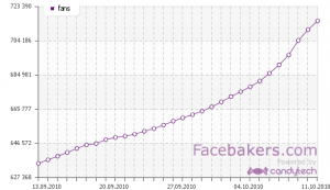
The Good? – Official Gap Facebook page Gap is acquiring a ton of new fans with the change. A tool that could be HUGE if they do follow through will a well branded “change our logo” crowd-sourcing project as promised.

What are your thoughts? Has the progress Gap has made thus far been undone? Or are bigger opportunities at large if they can make the situation right?

How QR Codes are heading sky high in Denver

6th October 2010

On my way through the Denver International Airport this weekend, I came across a great QR code brand integration. We have been talking about QR codes for quite some time now in DIG and while cool, like most things technology related, if it doesn’t serve a user purpose, it won’t be adopted.

Here are four reasons 1st Bank’s Ad display scores.

Education: Often times, people may not know what this giant barcode is let alone how to use it. The advertisement clearly calls out not only what it does, but how to make it work by suggesting a reader to download.

Purpose: Sure it’s fun to scan, but no one wants to scan a code to the bank’s website to learn about opening an account. In my opinion, this is one of the biggest missed opportunities for brands in uisng technology whether it be an app, a code or a game.

By allowing users to download books for a flight, users not only have a motive to download and receive a free book, but they have a greater chance of remembering who gave this service to them in the first place, creating a sense of brand affinity and loyalty without ever pitching a product.

Real life integration: We all love the web, but for social, mobile and new technologies to grow, we must rely on new and creative mediums to spread our messages. In this case, transforming a traditional ad to something any consumer could interact with and experience beyond a picture.

Placement: This ad was placed directly to the right of the security lines. What else are you doing while waiting in line for security than checking your phone and people watching? There is no better opportunity to grab a consumer than in this airport situation.

What are your thoughts? Are new mediums such as QR code integration still too advanced for the average consumer? Or has 1st Bank it a homerun with their placement and tech-savvy traveler target?